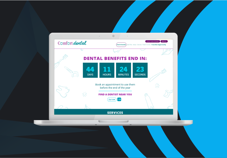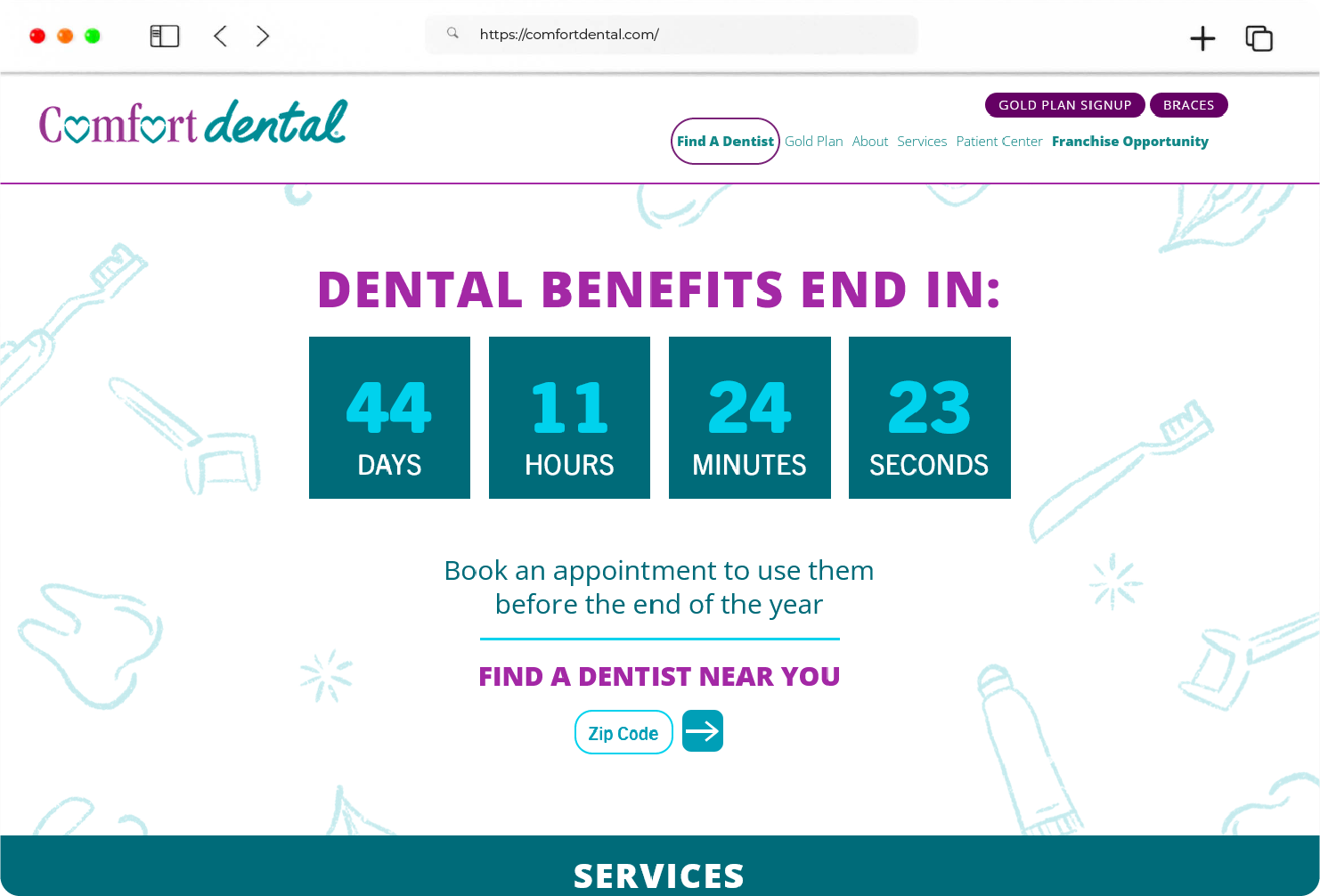
HOME PAGE
Considering there are thousands of dental websites out there, we made sure our website was something more than just a pretty face. Using several best practices like simplicity, visual hierarchy, navigability, and responsiveness, we’ve optimized the user experience from the very start.
SEAMLESS NAVIGATION
The main navigation features only the most important links to make sure the users are not overwhelmed by a wave of information. The hamburger menu also helps mobile users easily locate the hidden navigation, even if they don’t use mobile websites frequently.
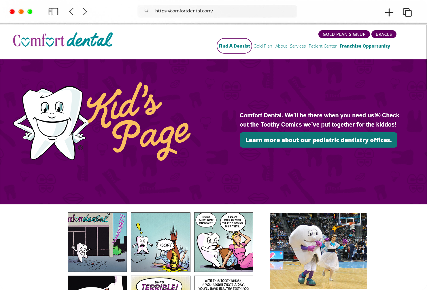
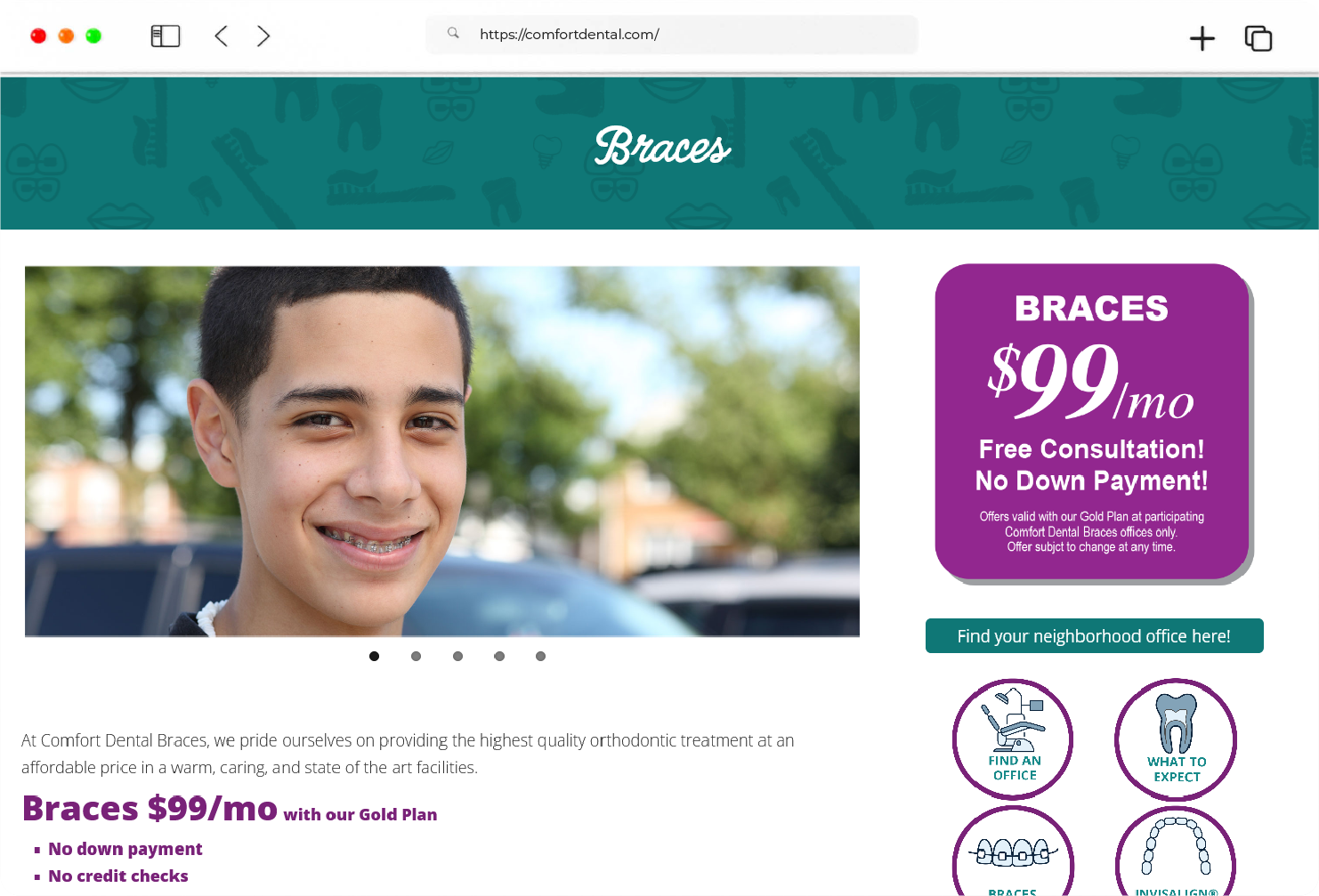
3. FEATURED PRODUCTS
On launch, Mywave greets users with a simple yet powerful splash screen design while tuning the system for a seamless user experience
BUSINESS INFORMATION
On launch, Mywave greets users with a simple yet powerful splash screen design while tuning the system for a seamless user experience
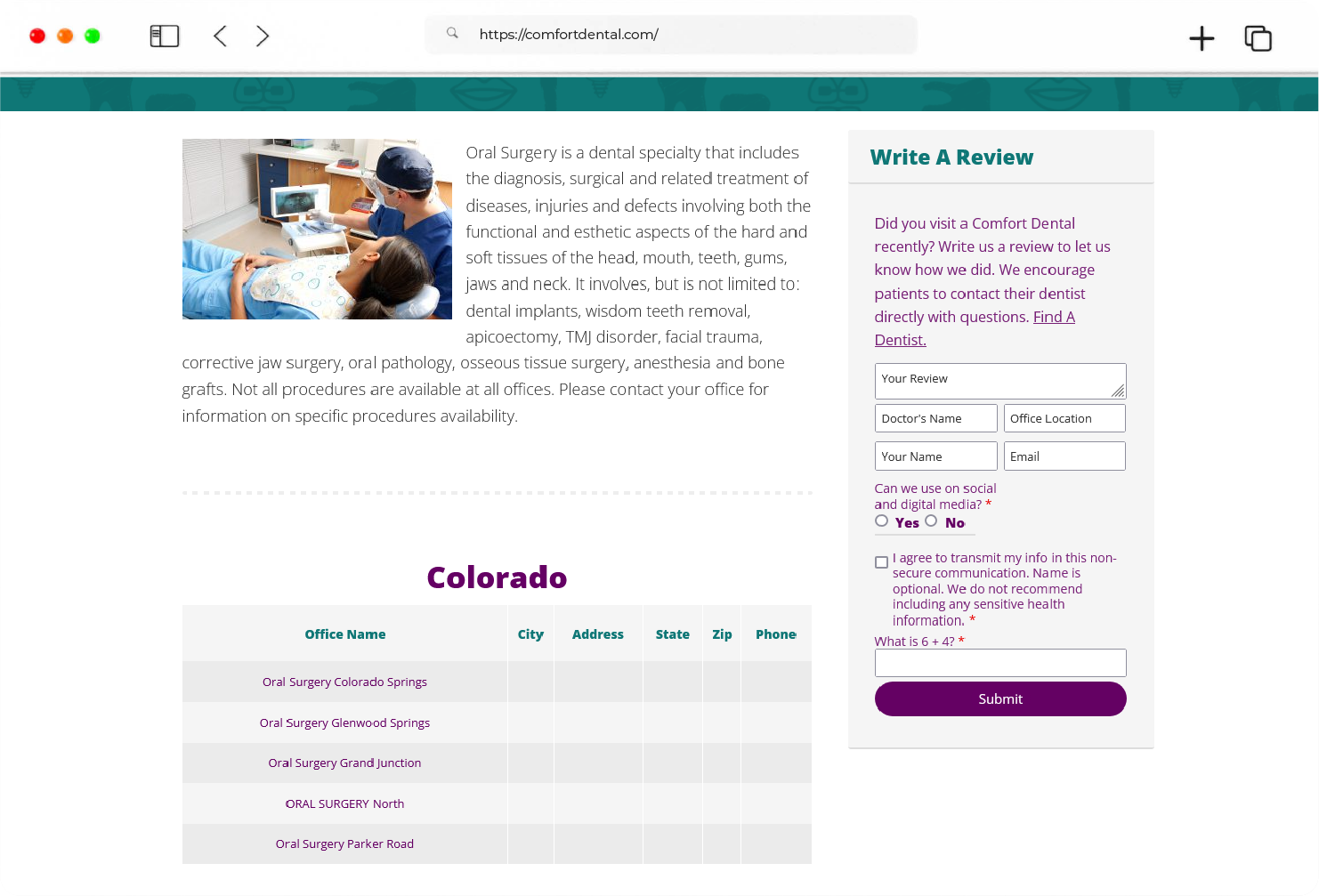
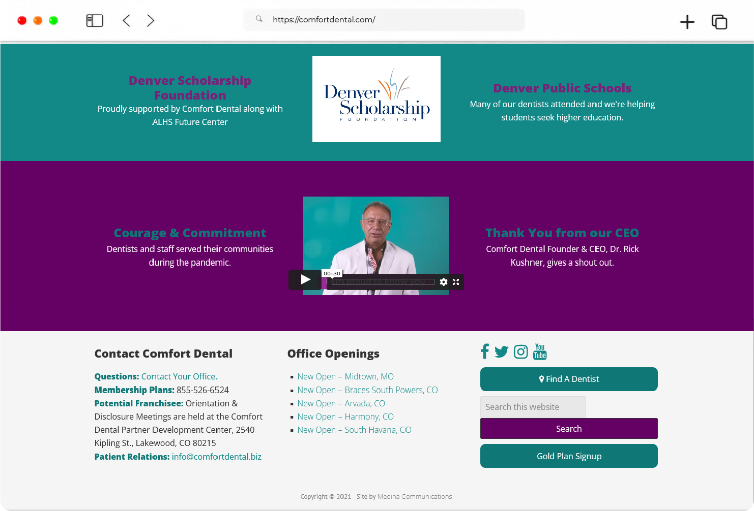
MEDIA PAGE
On launch, Mywave greets users with a simple yet powerful splash screen design while tuning the system for a seamless user experience
